02 · HOW WE LOOK
Useful aesthetics inspired by industrial design.
The XS visual system is built from very few parts, used the same way every time. Colour carries meaning, type carries the argument, and motion only ever explains something.
2.1
Colour
Ink and paper carry the work. Signal orange is the only accent, and it means something every time it appears.
Paper
#EFF0F1
var(--paper)
Primary ground. The default surface.
Surface
#F7F8F9
var(--surface)
Cards, plates, panels on paper.
Slate
#3D3B37
var(--slate)
Body copy at secondary weight.
Ink
#0E0F11
var(--ink)
Type on paper, and the dark ground.
On ink
#E6E7EA
var(--on-ink)
Type on the ink ground.
On ink muted
#B3B7BF
var(--on-ink-muted)
Secondary copy on ink.
On ink dim
#7D828C
var(--on-ink-dim)
Metadata on ink.
Signal
#FE5000
var(--signal)
The accent. Signal only, never decoration.
Signal soft
#FF9967
var(--signal-soft)
Reserved. Gradients and dips only.
ON INK
On ink over ink
APPROVED · 14.2:1
ON PAPER
Ink over paper
APPROVED · 15.6:1
ON SIGNAL
Ink over signal
APPROVED · LARGE TYPE ONLY
Orange is a signal, never a decoration.
It marks the one thing that matters in a view: a resolved target, a named cause, the live number.
NOT THIS
Orange headline, orange rule, orange button and orange icons on one page.
THIS
One orange element per view. Everything else is ink, paper or grey.
No colour outside the palette.
NOT THIS
Introducing a second accent for charts or states.
THIS
Build charts in ink and grey, and let signal mark the point being made.
2.2
Typography
A light grotesk for everything the reader reads, and a mono for everything the system labels. One weight in each.
DISPLAY / TEXT
Geist
Light (300) for headings, Regular (400) for copy. Never medium, never bold. Fallbacks: Suisse Int'l, Neue Haas Grotesk, Helvetica.
MONO / METADATA
Geist Mono
Regular only, uppercase, +0.02em. Codes, labels, figures and plate metadata. Never used for running copy.
Operational alpha
DISPLAY · .t-88
54 / 62 · -0.02em · 300
One statement per page.
Operational alpha
HEADLINE · .t-56
38 / 45 · -0.02em · 300
Section openers.
Operational alpha
SUBHEAD · .t-32
24 / 31 · -0.015em · 300
Beat and section headings.
Operational alpha
LEAD · .t-24
20 / 27 · -0.01em · 400
Standfirsts and pull lines.
Operational alpha
BODY · .t-17
17 / 26 · -0.005em · 400
Running copy. Measure 42–52ch.
OPERATIONAL ALPHA · NAMED
MONO META · .t-11
13 / 19 · +0.02em · mono
Codes, labels, plate metadata.
One weight per face.
Emphasis comes from size, space and colour — not from weight.
NOT THIS
A bold word inside a sentence to make a point.
THIS
A new line, a larger step, or one signal-coloured word.
Headlines end in a full stop.
NOT THIS
Arrows point to the cause
THIS
Arrows point to the cause.
2.3
Type layouts
Four arrangements cover almost everything. Each pairs a statement with evidence, and labels itself in mono.
A · HEADLINE + RULE CARD
Arrows point to the cause.
B · PLATE HEADER
Every framed field carries a header: a diamond, a label, a dotted leader, a code. It is the drawing's own labelling, and it never competes with the content.
C · METADATA ROWS
Label left, figure right, hairline between. Figures are tabular so columns align.
D · MONO FRAMING
Big-fund capability, finally within reach.
2.4
Grid and geometry
A 16px base grid, twelve columns, and one corner treatment. Nothing sits off the grid.
12 COLUMNS · 16PX BASE
CHAMFER · 20PX
2.5
The graphic system
Three atoms: the dot, the line, the arrowhead. Every icon, chart and mark in XS is built from them.
DOT · SIGNAL
One point of information, at rest. A resolved target.
LINE · MOVEMENT
Dots extrude into lines. Weight equals the dot.
ARROWHEAD · CAUSE
The head appears alone. Solid, on the grid, never a shaft.
ICONS · BUILT FROM DOT AND LINE
ORIGINATION
PORTFOLIO
REPORTING
TALENT
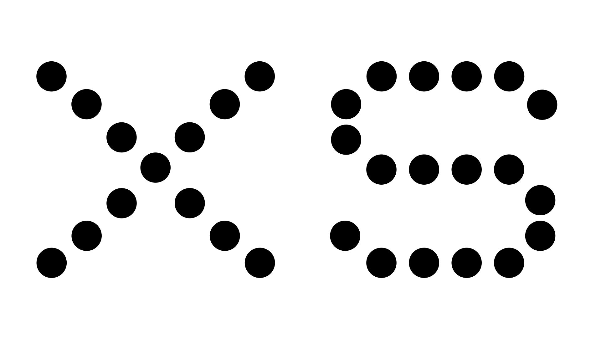
DOT MATRIX · BIG MOMENTS ONLY
The dot-matrix lettering is constructed from the same 5×7 grid as the mark. Use it for one statement or one figure — never for copy, never for navigation.
2.6
Motion
Motion in XS explains something or it does not happen. It is the system thinking out loud.
DEMO · STAGED REVEAL
DEMO · LINE DRAW, THEN RESOLVE
Scroll-driven, not timed.
Position in the scroll drives progress, so the same scroll always produces the same frame.
Reverses cleanly.
Everything that plays forward plays backward. No state is left behind on scroll-up.
One thing moves.
A single element resolves at a time. If two things move, the reader learns nothing from either.
Reveals are staged.
Head, then evidence, then metadata — each in its own window, overlapping only slightly.
Easing is a token.
cubic-bezier(0.16, 1, 0.3, 1). Fast out of the gate, long settle. Never a bounce.
Reduced motion is honoured.
With prefers-reduced-motion, content arrives in place at full opacity.
2.7
Imagery
Photography carries colour, but a restrained one. Hold every image in a chamfered plate, keep the palette close to the material world — concrete, steel, paper, skin — and let signal orange stay the loudest thing in the frame.
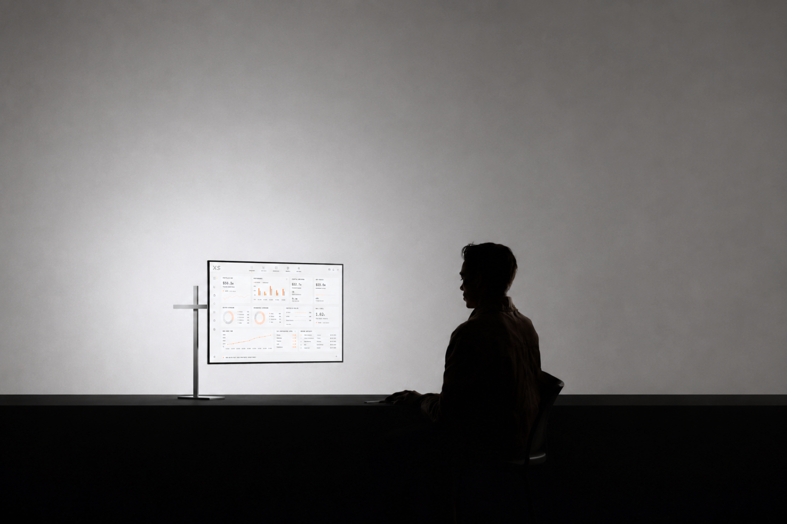
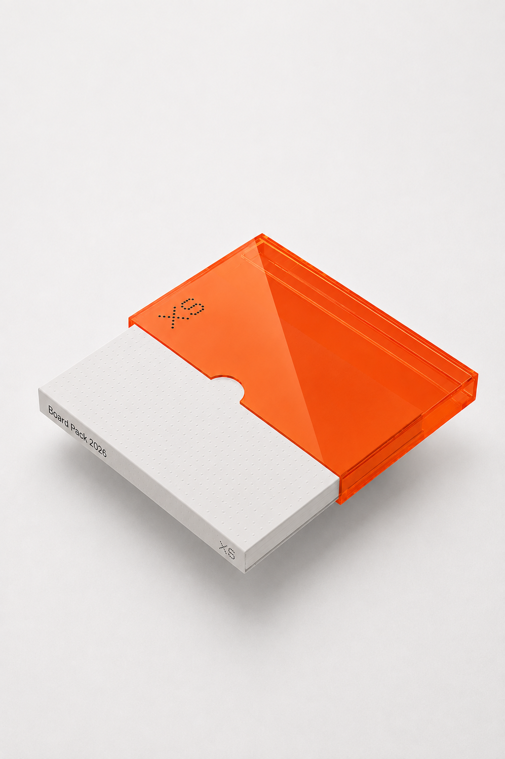
Colour is allowed. Loud colour is not.
Real materials have colour, and stripping it out makes the work look like stock. What we control is intensity: nothing in the frame should be brighter or more saturated than signal orange.
NOT THIS
A boosted, high-saturation image with competing primaries behind a headline.
THIS
The same image at natural saturation, held in a chamfered plate, with orange left as the only accent.
No second accent colour inside an image.
Orange is the only colour that carries meaning. Another strong hue in frame reads as a second signal.
NOT THIS
A red-and-blue lit interior sitting next to an orange marker.
THIS
A neutral interior where the orange marker is the only saturated element.